BRAND & USAGE
Brand guide
Everything you need to add Sign in with kunji consistently: the name, the logo, the official button, colors, and downloadable assets. When in doubt, use the official widget so the button always stays current.
The name
It's kunji, always lowercase, even at the start of a sentence where you can. The action is Sign in with kunji (sentence case; only "Sign" is capitalized). Don't translate it, pluralize it, abbreviate it, or restyle the wordmark.
- Do write "Sign in with kunji".
- Don't write "Kunji Login", "KUNJI", "Sign in with Kunji", or "kunji sign-on".
Logo
The kunji mark. Keep clear space around it of at least the height of the mark's stem, and don't render it below 20px. Use it on a light or dark surface as shown. Never recolor, rotate, stretch, add shadows/gradients, or place it on a busy background.

- Do keep the original colors and proportions.
- Don't recolor, distort, rotate, or add effects.
Lock graphic
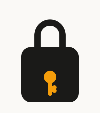
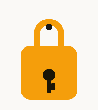
A padlock with the kunji key as its keyway — "be your own key." Two treatments that form a light/dark pair; pick by background, don't mix them in one place.
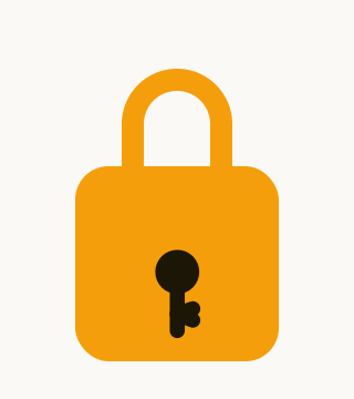
- Primary amber lock, dark key (matches the app icon): on light and dark surfaces.
- Alternate ink lock, amber key: for amber / low-contrast surfaces where the amber lock would disappear.
- Don't recolor the key, change the keyway, or use both variants together.
Animated: the lock hangs on a hasp and sways gently (a lightweight SVG; it stops still for visitors who prefer reduced motion). Good for a hero or loading moment.
The "Sign in with kunji" button
The recommended button is the official widget. Drop it in and it renders, opens the QR / code modal, and reports success. Because it's served from kunji, it always stays up to date:
<script src="https://kunji.cc/rp.js"></script>

<div data-kunji-signin
     data-app-name="Your App"
     data-audience="yourapp.com"
     data-session-url="/kunji/session"
     data-callback-url="/kunji/callback"
     data-poll-url="/kunji/status"
     data-theme="light"></div>
Set data-theme="dark" on dark surfaces.
Full integration guide →
If you can't run the widget, use the static asset below. Amber is the default; the dark variant suits light or neutral layouts where amber would clash. The amber button also reads well on dark backgrounds.
- Do use the provided asset or widget, at a min height of 40px.
- Don't recreate the button, change the label or key mark, recolor it, or crop the clear space.
Colors
The button and brand palette.
On the amber button the label and key mark are ink (#1a1a18); on the
dark button they're paper (#faf9f6).
Type & tagline
kunji uses Geist, falling back to the system stack
(system-ui, -apple-system, 'Segoe UI', Roboto, sans-serif). You
don't need to ship Geist to use the button; the asset and widget handle their own type.
The brand tagline is "Be your own key." Use it as a signature near the kunji name, not as a button label or inside the sign-in flow.